Showing posts with label work diary. Show all posts

Monday, 6 March 2017

WORK DIARY - documentary

How i made these images - 
These images were taken in China Town and at Camden Market in London to document life while there with friends. The images were taken without any planning and i think due to the decisive moment they became very powerful images. I set the camera to 1/25, F8 with an ISO of 800. The camera was hand-held and just taken when places caught my eye. The objective of documentary is to capture both historical events and every day life especially changes within society and basic changes to every day life.
Image one-
This image was taken spontaneously of Emma and Chloe. I edited the image through photoshop adjusting the contrast levels, the curve level and then later transforming the image to black and white to give it the known documentary look and feel to it. The candid image of the girls connotes femininity and freedom due to the relaxation of their bodies and facial expression. 


Image two-
Image two was taken similarly to image one however this timed around the image is used to promote the candid nature of the street rather than candid images of people. By doing this it emphasises the story of the street rather than the people creating emphatic and historic value to the image. To edit this i used the curve tool to create more dramatic shadows and then added the black and white layer to create the stereotypical documentary look.


Image Three-
This image was taken to document the social change of classical chinatown. The image contrasts therefore due to the casino and the opposing imagery of the Chinese new year thus suggesting the stereotype of 'china' has been taken away due to the generations of social and culture change in west London. The image was taken by judgment of 'the decisive moment' and was edited by adjusting the contrast and brightness levels. As well as the curve tool to give the image some depth. Personally this is one of my favourite photos due to the ideology behind it.

Image Four-
Image four captured the true and rare candid beauty of strangers. The image was taken in Camden and i was taking photos randomly. I believe the gentleman might've noticed that i was snapping images however, the lady was unaware and therefore this image is very true and beautiful due to its nature. To edit i just added a layer of black and white and then adjusted the contrast levels to keep the image true to itself.

Monday, 30 January 2017

WORK DIARY - composite image making

How i created these images-
These images were done in the college studio with a tripod a soft box and a reflector. The images were inspired by HANNAH HOCH.

Image one -
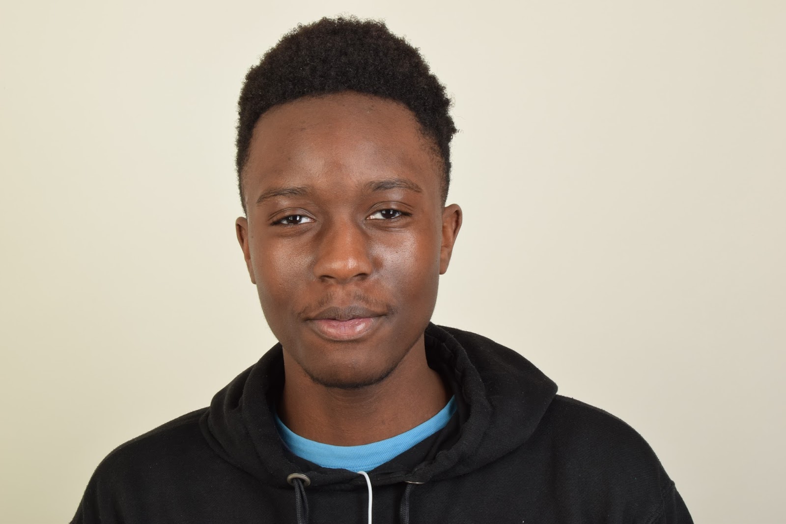
To create image one we used the studio with a white back drop along with a soft box, a reflector and a tripod. The camera was set to 1/25. F8 with an ISO of 800. To edit i used photoshop to digitally manipulate the models face rather than physically. To get the look i desired i used "The book of makeup" by Lisa Eldridge- i scanned the models face and transferred it to photoshop. In photoshop i added another layer to the background i then added a mask to fit several of the elements together , later i resized the woman's face to fit Kundai's face in proportion.  I then used the warp tool to blend and then made the image black and white to flow seamlessly. The reason for doing this was to see how well i could digitally manipulate an image like and to see how morals and ethics could be tested in photoshop.
Image two-


Image two was created similarly to image one by scanning a model from 'the book of makeup' once again. This image is more related to Hannah Hoch as it is visibly disturbing as well as being able to see how the two images should not join together, To create this image i cropped an eye out of the model and dragged it over to the image of Tim. I then duplicated the layer of the eyes and flipped the eye around to form two eyes. This method is a lot easier than method one. I then turned the image to black and white and cropped the image. 


Wednesday, 18 January 2017

WORK DIARY - aperture

How i made these images-
These images were taken in the colleges studio with a light box, a reflector and several other artificial lightings with a white and pink back-drop. The images were taken to show the change of aperture, focus and depth of field in an image. To focus on a singular point more than the other, although the subject is similar to 'Bokeh' instead of the whole foreground and background being out of focus in this subject of 'aperture' only one part is singled out. Which then makes it clearer to find the main focus in the blur of the background - In bokeh the background is out of focus is not unable to be identified, however in 'aperture' the background is only slightly out of focus which is good as it shows the change between the depth a lot easier to identify.
However one image was not taken in the studio and was taken on the college's grounds, to take this i used natural lighting and a hand-held camera, i manually adjusted the aperture to get the effect i desired.

Image one -
This image was taken outside college with a hand-held camera. The camera was set to automatic focus so I didn't adjust the aperture. To edit this i used the 'Black and White' tool on photoshop. I cropped the image down so that the image was a lot more compressed and the branch was the main focus of the image with a severely blurred background.  I later 'burned' some of the darker areas of the image so that the image would have a harsher depth of focus giving the image a lot more texture.

Image Two-
Image two was taken in the studio with a white back-drop. Using a tripod that was adjusted to fit each one of the models heights. I decided to use Tim as the main focus of the image as his bright scarf drew the most attention to the image. Nabil's t-shirt gave a pop of colour to the background as the focus was muted on Nabil i believed the change of focus worked extremely well as although you are drawn to Tim due to his instant focus, Nabil's presence is seen due to the red colour standing out. To edit this image i used the brightness tool in Photoshop which seemed to give the image a clearer projectivity. 

Image Three-
Image three was used for experimental purposes to see if we could manage to have two people at different points in the image to both be in focus and have Nabil in the background. Successfully it worked. The only negative is how distant model 1 and model 2 are , I would of preferred Model 2 to stand closer to Model 1 rather than Model 3. To edit this image i again, used the 'brightness' tool which emphasised the images cleanliness and darkened and defined the shadows.
Image Four-
In image four we used the pink back-ground in the other half of the studio to create a definition. In this image we used a tripod again however adjusted it to be a head-shot. I adjusted the aperture to f/22 to get a deeper depth of field. In this image there seems to be a lot more shadows than there really is which i like, to get this i edited it by adjusting the 'brightness' and 'contrast' levels. 


Image Five-
In image five I attempted to make both of the models bodies to be in focus, however unfortunately that wasn't the case as that only occurred on model 2 as model 1 was standing too close to the camera.  However, this is one of my favourite images due to the diversity of it. To edit this i used the 'Black and White' tool, i then later used the 'Burn' tool to emphasise the darkness levels and then as i wasn't satisfied with the contrast between the light and dark, i edited the 'brightness and contrast' levels which rewarded me with this black and white almost grainy image.


Monday, 16 January 2017

WORK DIARY - line

How I created these images-
To create these images i used artificial lighting from my bedroom which were the lamp as shown in the images and the spotlights in my ceiling. I used the 'manual' setting on the camera to get the effect desired, the images became quite texturised which I personally think came out really nicely. The images were taken by a hand held Nikon and all the images were edited on Photoshop using mainly the 'Curves' tool, 'brightness and contrast' and the 'crop' tool.

Image one -
Image one is one of my weaker images due to centralisation of the camera. The image itself displays four versions of the representation of line. The vertical and diagonal lines of the blinds, the lamp and the shade as well as the curved line of the mirror. I like the image however as previously stated if the image had been centralised then it would've flown better together. Editing wise i used the 'curve' tool and the 'burn' tool to emphasise the colour contrast between the shadows and highlights of the image.
Image two-
Image two of the blinds is similar to image one as i dislike it due to centralisation and the lights glare reflection on the blinds. To edit this image i used the 'curve' tool as well as the 'brightness and contrast' tool to get the required look. Personally i believe this image could be improved by more artificial lighting either side rather than mainly below the focus point.


Image three-
 This image is one of my favourites. The simplicity of the lamp shaded gives a lot of definition and texture to the image. Suggesting it could be seen as anything due to the diversity. I edited this by using the 'burn' tool to create a harsher definition between light and dark.  
I also cropped the image to get rid of the background so that the main focus was on the lamp shades contrast.


Image four -
This is also a favourite image of mine due to
the lamp shade simplicity. To take this i took
the lamp shade off and held it in front of the
lamp itself to create a sort of washed out affect
of the harsh lighting. I prefer this technique as
it's softer and creates a more dreamy effect.
I edited this by only mixing the 'contrast and
brightness' levels and i think the effect given is beautiful.


Image five-
                           I personally think this is the worst 
                                  image out of the five. The image is not
                                       centralised at all, the balance is highly off
                                   and the light is reflecting back on to the                     
                                    blinds. It shows the different line directions 
                                however not to the desired effect. I edited this by using the 'curves' tool only.

Monday, 9 January 2017

WORK DIARY - movement

How i created these images-
To create these images i used a light box and a reflector in a studio environment. A manual tripod was also used to create the stability needed for the models. I asked the model to move around, moving her hair and body vigorously so that the image was portrayed as moving. By doing so it created a really interesting look which i really liked- personally i loved this topic as it enabled my creativity to flourish.


Image one-
This is my favourite photo out of the five that i took. I personally love this portrayal of movement, the vision of the hair and the jacket moving especially. The lighting creates a sort of washed-out effect which i significantly like. To edit this i used the burn tool to darken the coat and left bottom hand corner. I used the black and white tool also and darkened the emphasis of the black and white.


Image two -
I like this image of the model i edited this by duplicating the image, then flipping and reversing image one i then put them both on a new canvas and then edited it into a lighter more washed out black and white.


Image three -
I love this image of Kia as it specifically shows movement of her hair. However i wish the image was of better quality. I edited the image with the black & white tool and the curves tool to darken.


Images four and five - These images are also ones that i wish was of better quality. I edited it by using the black and white tool and the curves tool. The camera is not centralised on image. The background is bitty and not a blank canvas. It isn't the turn out i would've liked. The images are blurry also which is something i do not like.

Thursday, 15 December 2016

WORK DIARY - reflection and framing

How i created these images -
To photograph these images i used a range of locations in harlow- These being, the college, outside and inside. A park, a carpark. I used a range of locations to find as many places as possible that enabled me to find framing and reflection.


Image one-
I personally love image one due to the framing of the image and the framing of the images within the image. To edit this i used photoshop and i used curves to manipulate the shadows especially inside the metal frame.
This image is mostly framing however does how reflection in it, in the top of the photo the sun is glaring on the metal causing a sun reflection to bounce back creating a highlight effect for the image.


Image two-
This image is for reflection due to the mirrored surface. This image is interesting to me because of the amount of reflection, how it reflects and the way it reflects. I love the use of the reflecting lines.
To create this image i used the brightness tool to emphasise the reflector.


Image three-
Image three is one of my least favourite images due to the framing. Although the framing is good my critical analysis on this image is that it should of been closer to the inside of the bin as it could've been framed better.


Image four-
This image has been manipulated with the black and white tool as well as the burn tool and the curves tool to create a very dark and eerie image. I really like this image due to the cleaver use of the reflection through the iPhone screen of the cars in the car park and cigarette. I think it is a really interesting photo. 

Image five-
This image was taken of a fence by a park to both represent framing and reflection due to the shadows. I believe this image is also one of my best due to the fact i have incorporated both reflection and framing. I edited this by darkening the shadows and brightening the whites in the image. I then added a black and white filter on top.


WORK DIARY - portraits


How i made these images -
These images were created by using a range of locations; thus being in a studio with a box light, soft light, a reflector, a tripod and a model. Where as in the other images we used natural lighting and outdoor locations with a model and a hand-held camera.

Images one, three- seven are inspired by Thomas Ruff.
Image two is inspired by Alec Sloth.


Image one- 
In this image i used a light box, and a tripod to create a professional looking image. In photoshop i edited the image by upping the brightness and using the 'burn' tool to darken the shadows. I like this image due to the use of props it makes the image look very patriotic.


Image two-
In this image i used natural lighting and a hand-held camera instead of a tripod. This image was inspired by Alec Sloth, with his outdoors images which are eerie.
Due to the natural lighting it created a softer looking image which enabled me to work with the shadows a lot more. I used the 'burn' tool to emphasise the shadows on the building, the model's jacket, and the road that you can see through the cracks.

I like this image as it is in a different style of portraiture than all the others that were taken in the studio.


Image three-
In this image we used the studio set up and i used a lower aperture to get the shadows i required, once i got them i manipulated them on photoshop by darkening them, especially by the neck. his arm and the bottom right hand corner to give the image some dimension.
When taking this image i decided that the model should assign his own poses so i told him to do what he wanted to do so he decided it would fit best to just move around and for me to decide when the perfect shot would be. I liked that idea and thought it worked really well as it enabled me and the model to function as we liked.

This is definitely one of my favourite images due to the pose and depth of the image.


Image four-
Image four was manipulated in photoshop by using the 'contrast' tool as well as the 'burn' tool. I then upped the brightness and it left me with a nice result. I tried to capture comedic aspects in this image which i believe turned out well.
I 'burned' the corners and the models back to again, create depth and dimension in the image.

I believe this image is one of my lesser good images as although i like the style of this image it just isn't captioning enough expression like the other images are. It would be better if the model had been doing a different pose which is a shame because i  do love the idea behind the image.


Image five-

This image is similar to image four, however with a different model and expression. I only manipulated the brightness in this adjusting it for the background and darkening the models clothing.
I believe the image reflects expression well as there were no set guidelines in the shoot.

However,
I do believe this is one of my weaker images and therefore there is not much to analyse. I wish i would've taken the image from a more centred perspective.


Image six-
This photograph is my favourite out of all of the images. I love the model's pose as it allows the model to express himself both facially and physically. To create this image i again, only used the brightness tool to manipulate the images clarity. The use of the flag is used as clothing which i really like, and it really stand out against the plain white background


Image seven-
The last image is heavily inspired by a mixture Thomas Ruff and  Richard Aveon ( without the black and white imagery ) both of their work is often studio based from waist upwards, especially allowing headspace- this image was taken with a light box and a reflector to create a professional look. The models positioning shows his self confidence. 
I used the burn tool here to create extra shadows. 

WORK DIARY - landscape

How I made these images -
To photograph these images, i used a high f/stop so that everything was in focus, and then i simply located the camera in various locations to get the desired look i wanted. Due to the lowlight after the storm it gave an eerie and creepy feel to every photo which i loved. The harsh contrast between the soft white of the clouds and the dark clouds created an amazing look and great feel to the photo. I used a tripod to achieve these images along with a fuji-film camera.

Critical Evaluation -


I chose both of these images as they are my least favourite of the five images. The lighting and framing was not as good as the other images.

I believe the images are too dark and the shadowing really brought the images down, I believe image two is heavily shadowed due to the location and time of day which caused the image not to look as good as it could've at a different time of day.

Although these photos aren't terrible, they do look slightly unprofessional due to the harsh shadows and contrasts- that do not run smoothly.


Image one is one of my favourite images taken in harlow. To take this image i manipulated it with photoshop with the 'curves' took to make the building look a lot darker and make the sky stand out a lot more. I intensified the contrast and the shading. I used a tripod from a low angle.. 


Image two is taken also in harlow, i used the 'burn' tool to manipulate the shadows here and this enabled the blue sky to stand out a lot more which i thought liked beautiful. I also intensified the contrast with image two like in image one.


Lastly, image three was taken in the same location as the previous images. To get this image i used a higher f/stop than the other two. In photoshop i only used the brightness tool and declined the brightness. I didn't emphasise it like images 1-4 because i wanted a more 'sundown' look which i think i achieved. By the colours of the clouds heavily contrasting with each other it enables the image to look almost 3D as if it were to be moving. I really like this image due to all the different components created.